How to present variance analysis using waterfall charts
Hey there,
Today’s post covers how to present variance analysis using waterfall charts.
You will learn:
What is variance analysis
What triggers a business partner eye roll (yep, we’re getting scientific)
What are waterfall charts
What are the benefits of water charts
How to create waterfall charts in excel
How to use waterfall charts to present actionable insights
Business partner eye rolls are scientifically proven to weaken your promotion prospects as an accountant or financial analyst.
Don’t let this terrible thing happen to you and your career.
Waterfall charts can help.
Let’s dive in.
What is variance analysis?
Your company has a financial scoreboard called actual results.
These results cover cash, revenue, and profit.
And your business partners are incentivized to crush these results.
What if you could help your business partners do just that?
This isn’t a rhetorical question.
We’ve done this very thing at multiple public and private companies.
And you can do it too. 👊
To equip your business partners with this information on financial performance, an accountant or financial analyst must compare them to what was expected.
This is called variance analysis — the comparison of actual results to a budget or prior period’s actual results.
Actual results can drive two types of variances:
Favorable = more cash, more revenue, less expense
Unfavorable = less cash, less revenue, more expense
Here’s a tip: want your business partner to pay ZERO attention to your analysis?
Use all numbers, aka a number wall like this 👇
Now as an Accountant or FP&A professional, you may say this is the most amazing data table ever.
DISCLAIMER: we LOVE data tables, they speed up reporting and analysis.
But your non-finance business partner crowd will glaze over in boredom.
And they are the ones you want to help.
Business partners want data, but they also want to get straight to the point.
Your mission with variance analysis: avoid getting the business partner eye roll.
Here’s how.
What is a waterfall chart?
A waterfall chart is just that, a chart.
No fancy flying here, anyone with excel can create one in under 20 seconds.
What makes a waterfall chart unique is the way it visualizes changes.
It has a start and a finish.
And in between, it highlights all the variances (aka drivers) that got us there.
Positive value drivers are shown as upward bars.
Negative value drivers are shown as downward bars.
A picture says a thousand words, no word wall needed.
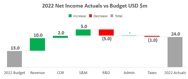
This waterfall visualizes 2022 Actual Net Income vs Budget.
It shows how a budgeted profit of $13.0m turned into an actual profit of $24.0m.
This is the SAME data we presented above in the data tables.
The difference is how the data is presented.
So what makes this waterfall chart so special?
Here are the benefits of using this visual to present variance analysis:
Easy to understand
Focuses attention on material drivers
More interesting to look at than a data table
Key takeaway: be clear, be concise, and be visually appealing.
This recipe will drive business partner engagement during presentations.
Now let’s create a waterfall chart together.
How do we create a waterfall chart?
Behind the scenes, you need to get data and organize it in certain ways.
Here are the steps.
Step 1: Get the data
Actual results and budget data may live in separate places.
Or the data may live in the same place.
Regardless of where the data lives, pull all the information into one table.
Our example above is using a simple profit and loss (P&L) format.
Step 2: Calculate the variances
Start with the actual or latest result.
Then subtract the prior period or budget assumption.
You will be left with a variance.
Our example compares 2022 Actuals to 2022 Budget.
Step 3: Determine the drivers
Now create a separate table that will link to the data you pulled.
Your starting point is the prior period or assumption.
From there you can choose what drivers to call out.
Then finish with the actual result that compares to the starting point.
Using the P&L example above:
start with Budgeted 2022 Net Income
add in drivers which are the P&L account variances
finish with Actual 2022 Net Income
START + DRIVERS = FINISH
Step 4: Create the waterfall chart
This step takes less than 20 seconds.
Don’t believe me?
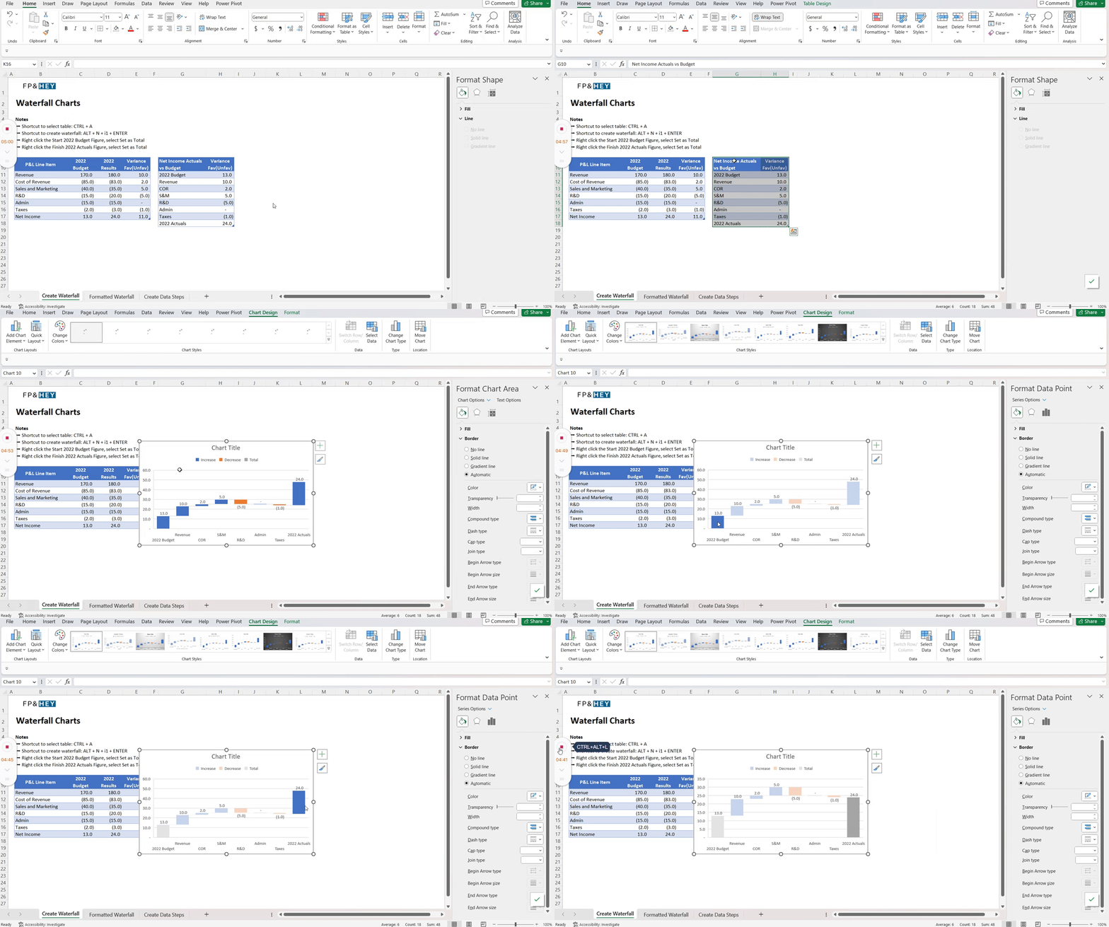
Watch the clock in the gif.
Highlight your data table by clicking it and hit CTRL + A to select it.
Hit ALT + N + i + 1 + Enter → creates your waterfall
Right-click the 2022 Budget bar and select Set as Total
Right-click the 2022 Actuals bar and select Set as Total
That’s it, mic drop. 🎤
Now let’s make this chart pretty and get that promotion discussion started.
Step 5: Format the waterfall chart
Less is more when presenting a chart.
Don’t distract the audience with things that don’t add to the explanation.
And make sure colors are logical.
For some red = bad and green = good.
Here are the steps you can take to make this a practical work of art:
Make the title bold and explain what you are comparing
Click the legend box where it says Increase, Decrease, Total.
Click Increase and change the color to GREEN.
Click Decrease and change the color to RED.
Remove the grid lines by right-clicking them and selecting Delete.
Remove the Y-axis labels by right-clicking them and selecting Delete.
And voila, here’s the final output.
What do you think?
Will your business partner be more receptive to this than a data table?
That’s a big 10-4.
Conclusion: No more business partner eye rolls
Congrats, your variance analysis is now WAY more engaging.
And all you did was change the way you presented data.
Waterfalls can be used for all types of variance analysis.
Here are a few examples:
Revenue by region
Gross margin % by product
Customer count by segment
Remember — less is more.
Get to the point.
And focus on the material drivers.
🔥Bonus tip: here’s how to make an impactful financial presentation
Presenting information with these things in mind will help you build stronger business partner relationships.
Why?
Because this helps your business partner crush their numbers and get paid higher bonuses.
That will give you serious street cred.
Which leads to your own higher bonus and future promotion. 👊
How do you feel? Ready to present variance analysis to your business partners?
Let us know by replying here or emailing us. If you have any specific topics you’d like to share, let us know!
Now go have fun making an impact on your business and your career!
Cheers,
Drew & Yarty


